

How do you take a massive municipal website and cut it down to the essential elements for a mobile app?
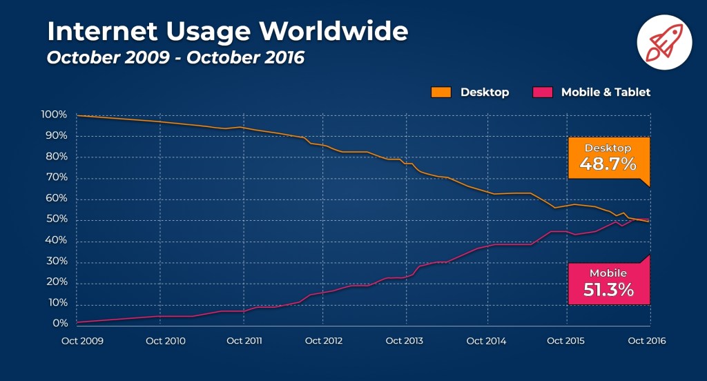
For most people, their mobile device is within arm’s distance. With this kind of proximity, it’s no wonder over half of the internet traffic comes from a mobile device. In today’s mobile-first society, all businesses need to have a well-functioning mobile website or app. However, designing for the tiny screen of a mobile device has its challenges.
Priorities for Designing a Mobile App
Interested in learning more about my town, I struggled to use Trumbull’s website. I decided to reconfigure the Town of Trumbull’s website, and now I’m taking on the challenge of creating the mobile app. I quickly learned that the desktop website’s entire structure had to be simplified and reformatted to a vertical layout. The menu options and forms must be simplified, and the search feature must be more robust. Additionally, the app had to accommodate large design elements such as legible text and buttons tapped with a finger.
Before I began framing the Information Architecture (IA), I learned the importance of cognitive psychology pertaining to websites. By considering how the human mind works, I can better organize the website information and map the flow between content for a solid foundation. The key principle of cognitive psychology as they relate to IA are:
- Gestalt Principle: The brain will organize objects into patterns and groupings to simplify and organize information.
- Mental Models: These are the assumptions people have in their minds before they interact with a product.
- Cognitive Load: The amount of information a person can handle at a given time.
User Research
Keeping the cognitive psychology principles in my mind, I decided to interview a town resident regarding their experience with the town of Trumbull’s website. I started by asking which services he looks for most, and then I asked him to find them. He stumbled and became frustrated when he could not figure out which menu item to choose. He said, “This navigation does not make any sense. I can’t find the same thing again.” After trying the search function with no results, he resorted to clicking every menu item until he found what he needed.
Next, I went to a Trumbull group’s Facebook page and searched for the main topics people were looking for advice on. I could not find information on the official Trumbull website because they do not allow posts from others. Last, because I am a resident, I documented why I use the town’s website. I compiled a list of the topics residents are most interested in finding more information about:
| Resident Goals | Facebook Group Goals | My Goals |
| Get a building permit | Summer Camps | Swimming Lessons |
| Office Hours | Golf Courses | Library |
| Car Sticker | Real Estate | Parks |
| Summer Events | First Selectman News | Car Sticker |
| Park Information | Vaccine Information |
Ideation
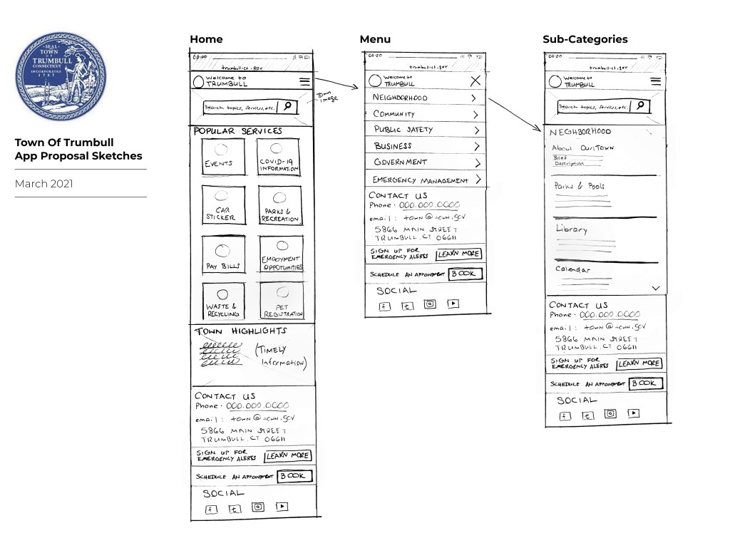
From all of the information gathered, ideas have now begun swirling in my head. I felt the best way for me to make sense of my thought was to sketchstorm. Sketchstorm is an ideation technique where participants quickly sketch their ideas. The sketches are very rough and free-flowing. My sketches helped me visualize the app’s functionality, and I felt I could see it coming together.
Site Map
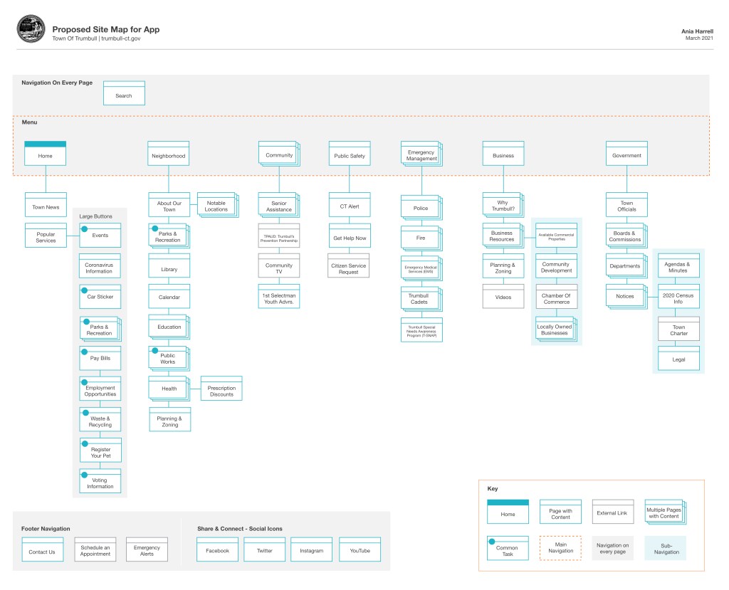
Using my sketch and my proposed Trumbull website desktop site map, I created a comprehensive site map for the Trumbull town app. This map is the foundation of the Trumbull app providing the hierarchy, the main navigation, and sub-navigation. All of the content is grouped and organized to help users find what they are looking for faster. Most importantly, popular tasks are featured on the main page in a new “Popular Services” menu.
I used the application Adobe Xd to create my site map and found it incredibly simple, especially for someone familiar with Adobe Illustrator. I was happy my learning curve was minimal, and I’m excited to learn more about what the app has to offer.
Summary
The process of creating a comprehensive Information Architecture plan for a website or app is laborious. After Sifting through pages of content and trying to make sense of town government jargon, it was obvious the Trumbull website was created by its own employees. All of the menu items seemed to be broken down by various town departments, which a layperson would not recognize. My work is only a sliver of a robust process creating a solid IA foundation for a website. The end goal would be to create a site that functions well for the townspeople.
References
Babich, Nick. (2020) The Beginner’s Guide to Information Architecture in UX.Xd Ideas. Retrieved from: https://xd.adobe.com/ideas/process/information-architecture/information-ux-architect/
Champman, Cameron. Exploring the Gestalt Principles of Design. Toptal. Retrieved from:
https://www.toptal.com/designers/ui/gestalt-principles-of-design
Experience, Abu. (July 2017). 10 Mobile UX design principles you should know. Uxbert.com. Retrieved from: http://uxbert.com/10-mobile-ux-design-principles/#.YF_VsV1Kh6o
Law, Thomas J. (December 2020) Mobile website design in 2021: Everything you need to know. Oberlo. Retrieved from: https://www.oberlo.com/blog/mobile-website-design
Mobile Vs. Desktop Internet Usage (latest 2020 Date). BroadbandSearch. Retrieved from:
https://www.broadbandsearch.net/blog/mobile-desktop-internet-usage-statistics
 To Mulberry Street Marketing & Design
Leave a comment