
Prototyping plays a vital role in the process of creating successful UX
Nick Babich
One of the most crucial steps of designing a product is creating prototypes to test and gain valuable user feedback. Each round of prototyping and testing will bring the design closer to a more user-friendly final product. Recently, I began a new prototyping journey for a town app called “Explore Trumbull.” This app is a simplified version of the town’s in-depth, albeit overwhelming, desktop website. Explore Trumbull takes the most popular user functions and highlights them to make it easier for town residents to access.
Over the last few weeks, I created a low-fidelity prototype using paper and pens then tested it to gain valuable feedback. From the user comments, I felt confident enough to invest the time into creating a more in-depth, interactive, high-fidelity prototype.
What’s the Difference Between Low-Fidelity and High-Fidelity Prototypes?
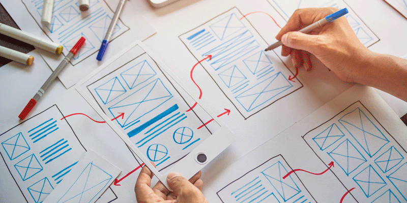
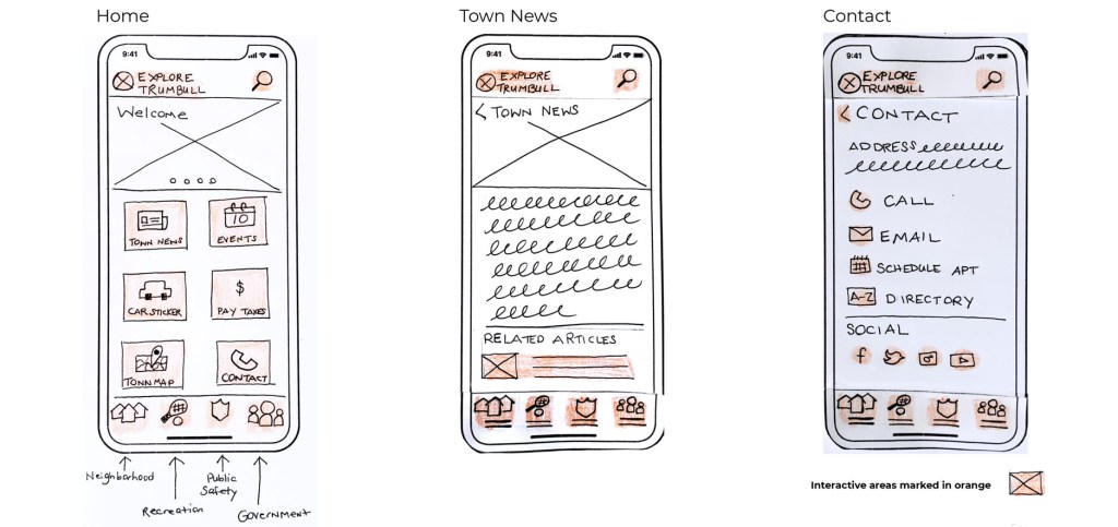
Low-fidelity prototypes are simple sketches with the primary goal of sharing ideas and collaborating with others. The benefits of low-fidelity are that you can create multiple versions quickly, you only need a pen and paper, and it’s inexpensive. Low-fidelity prototypes also foster more collaboration between team members because anyone can draw; they don’t need an art background or a thorough comprehension of design software. The disadvantage of low-fidelity prototyping is that some details may be unclear, and interactive elements cannot be tested. Overall, to test functionality and initial concepts, low-fidelity prototypes are very valuable.
High-Fidelity Prototypes
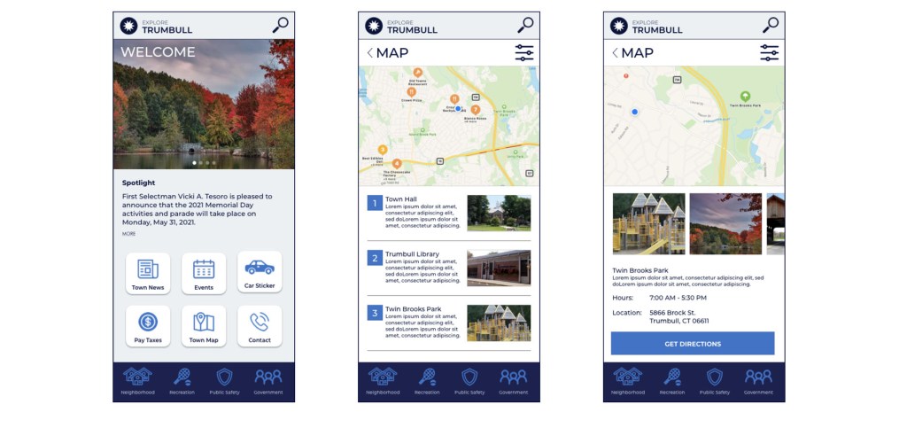
Low-Fidelity prototypes are great for early rounds of testing, and with the feedback gained, designers have a better sense of how to create high-fidelity prototypes. With high-fidelity prototypes, far more details are introduced, such as color, photography, icons, animations, and interactions. High-fidelity prototypes can look and function almost like a final product.
Medium Fidelity
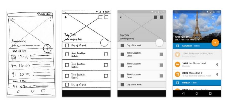
Between high and low fidelity are prototypes is a gray area known as medium-fidelity. These designs are no longer sketches but are not to the level of detail as high-fidelity. Instead, they would include fewer colors and simple shapes to illustrate an icon or photo. Medium fidelity also introduces some interactive elements. Below is an example.
Explore Trumbull App Low-Fidelity Prototype
Town websites are notorious for being over-cluttered and challenging to navigate. After researching users, their goals and creating wireframes, I made a low-fidelity prototype for testing. I used a pen, paper, and crayon. Once my sketches were complete, I used a website called Marvel to create a clickable prototype. With my first Explore Trumbull prototype, I tested it by giving my users a series of tasks to execute. The feedback I received was incredibly valuable. Here is a breakdown of what the users said:
- One user was not sure how to select an event because the sketch only showed dummy text.
- The word “Sort” was confusing on the Map page.
- One user was not sure how to find Summer Camps, but another knew right away.
- There was confusion surrounding how to start the process of paying taxes.
- The Details and Go buttons on the Map page were not clear. Also, users wanted to click on the map pins.
- A user suggested an “Add to Calendar” feature when the process of signing up for a summer camp was complete.
Jumping from Low-Fidelity to High-Fidelity Prototypes
Armed with user feedback, I felt confident to bring the Explore Trumbull app to life using the prototyping software, Sketch. I was excited to begin stylizing the app with color and photography. To start my design, I chose a simple color palette of navy blue and cyan because blue is the current color of their logo, and it evokes the feeling of trust and calm. Then I created a basic logo reminiscent of a compass or a sun, a slight nod to the name “Explore Trumbull.” With the colors and logo established, I started laying out the app in Sketch. With the help of LinkedIn Learning, I found it reasonably easy to use.

However, when it came time to animate and link pages, I began to get frustrated. Every other aspect of Sketch was so simple; why couldn’t I add a dropdown menu or a pop-up overlay? After some googling, I found I needed an additional plug-in which I did not have the capacity to learn at that moment. With the tight deadline I had, I decided to focus on functionality and forge ahead. For my next iteration, I plan to explore the various Sketch plug-ins.
Taking the user feedback into consideration, I added as much text and photography as I could into my high-fidelity prototype. I paid close attention to the steps users needed to take to complete a task. When a user is looking to pay their taxes, only one step is presented to them to eliminate confusion. I also revamped the maps pages by including more details such as landmark names and underlined the clickable text. Additionally, I made a large “Get Directions” button to better clarify how to get the destination. The last change I made was adding the “Add to Calendar” feature to complete summer camp sign up. Click here to watch a video walk-through of the app. Overall I’m pleased with the prototype, and I think it’s ready for the next round of testing.
Final Thoughts
The leap from low-fidelity to high-fidelity prototyping is dramatic, from black and white pen sketches to glossy interactive animations and details. However, since high-fidelity prototypes require a lot of time and effort, it only makes sense to work out significant functionality and interactive elements using low or medium prototypes. Both of these options are so much more agile and flexible, and surprisingly, users had no problem understanding the functionality low-fidelity prototypes offer. Once the prototypes are in good standing and you feel confident in the design, invest the time and energy into a high-fidelity version. In the end, it is gratifying to see a concept brought to life looking and functioning as you intended. You gain a true sense of how users will interact with your creation that you worked so hard on.
To see the complete process of the Explore Trumbull App, click here:
 To Mulberry Street Marketing & Design
Leave a comment