

With the popularity of smartphones and tablets, people began to realize they didn’t need expensive computers just to browse the web or check email. It is much easier to reach into your pocket and find what you need from a smart device. However, brands realized their desktop websites did not work well on smartphones creating a bad user experience. To keep up with this trend, companies started creating secondary mobile websites that were more streamlined. This required double the work from web development teams. Businesses not only had the task of managing the content and quality multiple times and the cost of the added resources to do so, but users also didn’t like the disjointed experience either. All around, separate desktop and mobile websites were not a good thing.
Enter Responsive Design
Over time, developers began to figure out creative ways to adjust website content to different screen sizes, but there was no standard. Then, around 2010, a web designer named Ethan Marcotte coined the idea of “Responsive Web Design.” He found that the combination of using flexible widths, images, and styles baked into the website’s code. As a result, you can create a website that automatically reformats itself to fit the screen size it’s viewed on.
“Responsive Web Design is about using HTML and CSS to resize, hide, shrink, or enlarge automatically a website, to make it look good on all devices (desktops, tablets, and phones).”
W3Schools
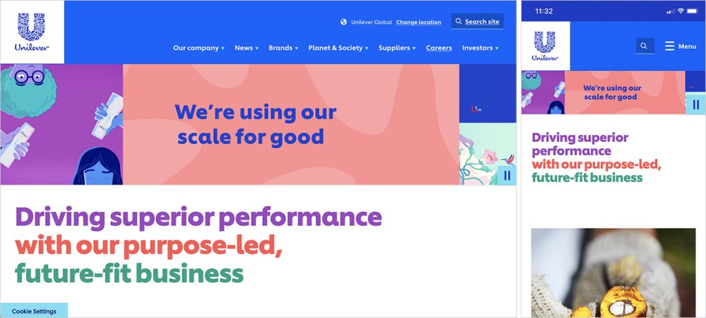
Benefits Of A Responsive Website
Only a dozen years later, the concept of a responsive website has become a development best practice. It is to the point where Google ranks responsive websites over non-responsive versions on its search results page. In addition to better SEO rankings, here are more ways responsive websites are beneficial:
- More website traffic. Over 55% of web traffic is from a mobile device. Since most people carry their mobile devices on their person, it’s easy to browse from anywhere- at the store, getting gas, even sitting on the couch. Smartphones and tablets make the internet so easily accessible that there is no need to pull out a laptop or sit down at a computer.
- Consistent user experience. Having the same website that simply resizes from device to device offers the user a seamless experience. They know where to find the information they’re looking for. A dedicated mobile website that is inconsistent with the desktop version makes a brand seem untrustworthy and will diminish the perception of the brand.
61% of users leave a website if they can’t find what they’re looking for.
-Marketpath
- Easier to maintain. Before the popularity of responsive web design, companies often created separate dedicated mobile websites. Managing two websites requires more time and manpower and leaves room for error. With a responsive website, updates only need to be made once.
- Ready for Future Innovation. Because responsive websites include so much flexibility, they are ready for more new screen sizes. Even today, responsive websites function on a wide variety of smartphone screens, smartwatches, and horizontal and vertical displays. With all of the new innovations constantly happening around us, we can’t even begin to fathom what’s to come.

Responsive Website Disadvantages
In a word, there are none but some may feel there are a few drawbacks.
- Slow to load. Because of the extra code and additional data necessary, such as images intended for a larger screen, a responsive website may take a bit longer to process before the site can load correctly.
- Longer development time. When building a responsive site, developers must write more code to account for all the ways the website needs to adapt. They also need to take extra steps to check their work on various screen sizes.
- Tricky to Navigate. Most mobile websites collapse the website’s navigation to make room for a web page to fit on the small screen, so finding the main navigation can be tricky. Also, when the user opens the menu, it covers the page, so they can’t see the page they were just on. This can lead to some minor confusion.
Final Word
A responsive website is the way to go for a better user experience, better SEO, and less time and money spent on development and management. Moreover, almost all websites aim to provide a positive experience for their users, and a responsive site will provide them with the ease of use and consistency they require.
References
W3Schools. HTML Responsive Web Design. Retrieved from: https://scholarlyoa.com/responsive-web-design-is-important/
8 Reasons to Have a Responsive Web Design (Infographic). Marketpath. Retrieved from: https://webservices.marketpath.com/digital-marketing-insights/8-reasons-to-have-a-responsive-web-design-infographic
Koishigawa, Kris. A Brief History of Responsive Web Design. Free Code Camp. 2021. Retrieved from: https://www.freecodecamp.org/news/a-brief-history-of-responsive-web-design/
History of Responsive Web Design. Excite. Retrieved from: https://exsite.ie/history-of-responsive-web-design/#:~:text=Coined%20by%20Ethan%20Marcotte%20in,orientation%E2%80%9D%20(Smashing%20Magazine)
 To Mulberry Street Marketing & Design
Leave a comment