
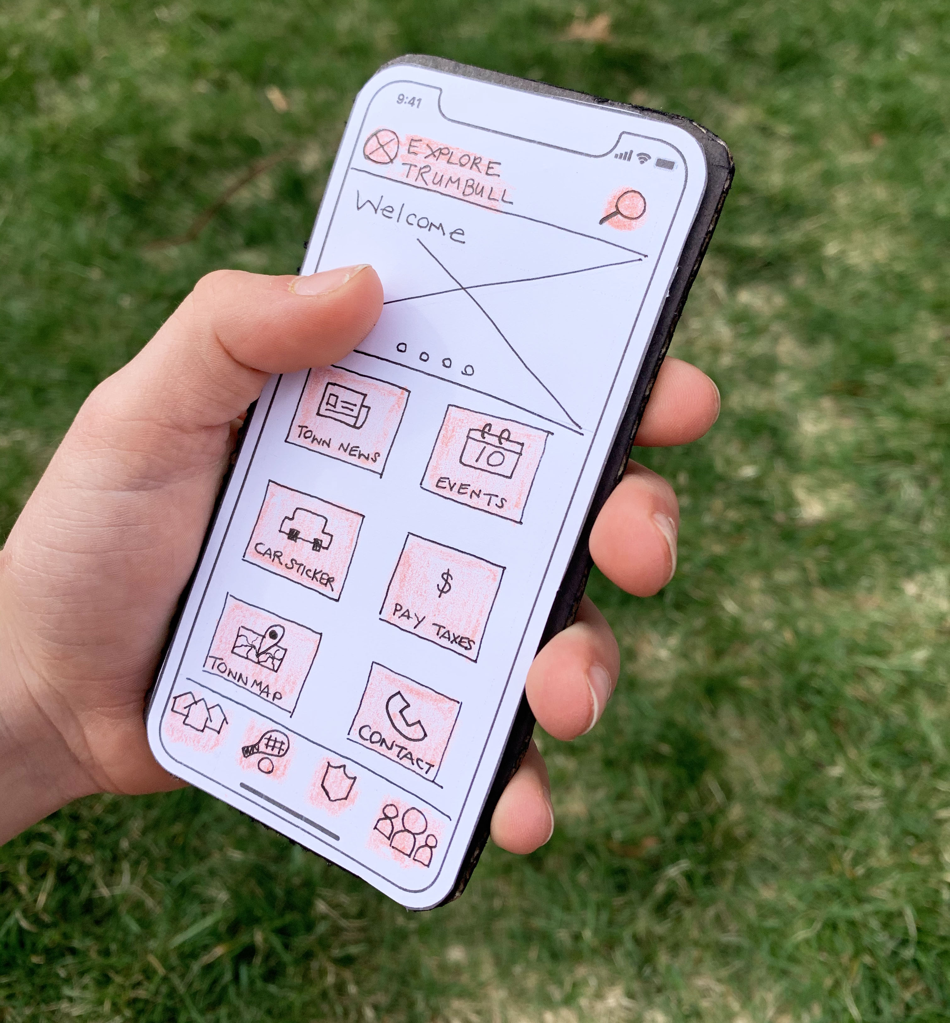
Explore Trumbull Paper Prototype
Communicating an idea is often a challenge. The picture you have in your mind’s eye is most often not the same as another person’s. With low-fidelity prototyping, it’s an opportunity to share your ideas and get feedback. The fact that a prototype is a physical object can inspire new ways to explore the same idea. Additionally, when others are involved in your process early, they will be more apt to help and provide alternative solutions. Paper prototypes can help designers work through the steps of a user flow, explore various layout options and show the basic structure of an app. In this post, I will outline how to create a low-fidelity paper prototype along with my experience creating one for a new app called Explore Trumbull.
“I’ve always found it easier to explain ideas through a drawing than it is by talking.”
Graem Fulton
Why Paper Prototype?
By creating a paper prototype, designers can work out their design strategy. It’s an opportunity to begin to flesh out how a product can come to life. Once you start roughly sketching how a product might work, you can count on running into roadblocks. With paper and pencil, it’s easy to erase or scrap an idea and start again. In other words- iterate often. Once you get into the flow of an idea and you feel pretty good about your work, share it!
Creating Prototypes
Although the word “prototype” feels like you must engineer something complex, low-fidelity first drafts start with a basic pencil and paper. The key to a successful prototype is to try to keep it as close to 100% scale as possible. This helps to put your sketches on a weighted background such as cardboard. When you share your prototype, this will help put your user in the mindset of using an app and help them envision it in real life.
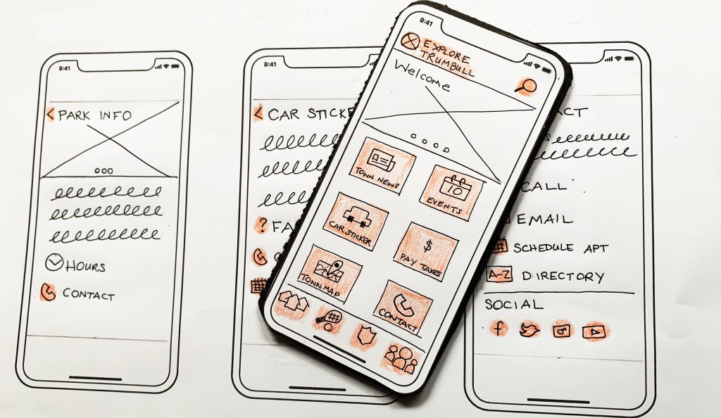
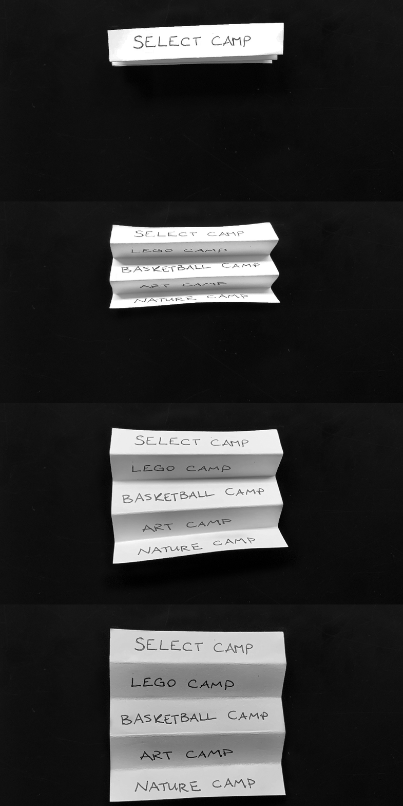
In addition to paper and pencil, be resourceful and try using sticky notes for pop-up windows or accordion fold a piece of paper to represent the digital accordion menu function. You can also take screen captures of your phone keyboard and print it out; then, whenever your app uses the keyboard feature, you can place the print out on top. Creating a paper prototype takes time, but it will be far less than designing on the computer.
The added value of the low-fidelity paper prototype is that people will pay more attention to the functionally than the individual design elements. Also, because the ideas are still only in their infancy, it’s less likely you will be offended by any criticism. You didn’t spend enough time on the details to feel attached.
Getting Feedback
When the paper prototypes are ready, start sharing them with others. It is recommended you work with a partner to assign tasks and goals to users, and then you can swap your sketches in and out of the user’s view as they interact. It can also be helpful to record the user’s interaction for reference later. Simultaneously, the user interacts with the prototype note what challenges they may have and what is working smoothly. With this feedback, you can refine your ideas. Keep creating prototypes and test often until you feel confident in the functionality. Once you’ve honed the prototype, you’ll know you are ready to start wireframing and bringing your product to life digitally.
My Low-Fidelity Prototype for the Explore Trumbull App
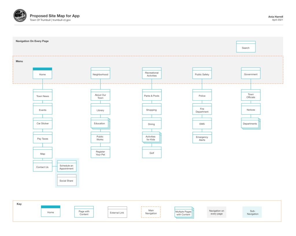
Before I began building my prototype for the Explore Trumbull App, I worked on a site map. I took a sitemap from the town of Trumbull website and boiled it down to its most important elements. Then during my app research and my sketching phases, I revised my site map again. Below is my third iteration.
Navigation
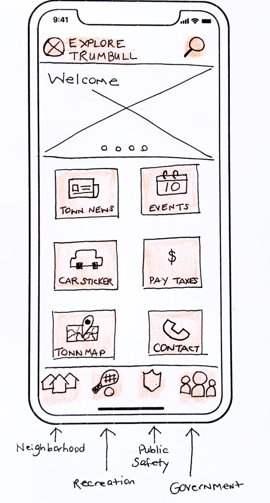
While researching various apps, I came across some navigation and features I wanted to incorporate into the Explore Trumbull app. Each idea I felt would be beneficial to the app user. My first idea I wanted to incorporate was tab navigation at the bottom of the screen. Facebook, Houzz, Amazon, and so many more apps use this type of navigation. I felt many people were familiar with it, and it was much nicer to see the entire main navigation in icon form on every page versus a hamburger menu in the top left or right corner.

Mapping
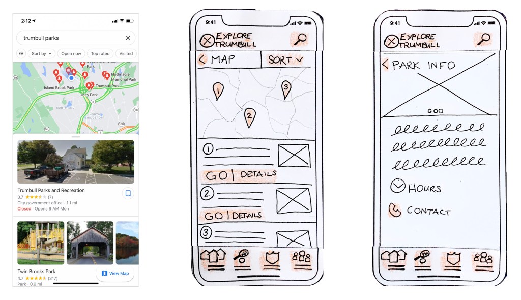
The next feature I wanted to incorporate was a map. One of the reasons for the app is to help residents explore the town of Trumbull and the beautiful parks, hiking trails, and golf courses it has to offer. From new to lifelong residents, I thought a map would be beneficial for users to find their town perks easily. Building on functionality users are already familiar with; I looked to Google Maps and how pins are placed on the map that corresponds with destination details at the bottom.
Icons
The last feature I wanted to incorporate into the Explore Trumbull app is large buttons with icons. This was for three reasons. First, people want brevity, and when they read online, they skim- especially with an app. According to the book “Don’t Make Me Think” by Steve Krug, he states, “One of the very few well-documented facts about Web use is that people tend to spend very little time reading most Web pages. Instead, we scan (or skim) them, looking for words or phrases that catch our eye.”
The second reason I wanted to use icons is that pictures are much faster and easier to comprehend. I will never forget watching my four-year-old daughter tell me all about an app because she understood the images so clearly. She knew precisely how to navigate, and she did not know how to read. The app she was using was not designed for children.
The final piece in sketching my prototype was to keep everything large so that it was easy to tap. With fingers as the navigation tool, I did not want anyone to accidentally tap on an area they did not intend causing frustration.
Pulling it all together
Throughout my years of designing, I have always enjoyed prototyping. It gives a designer an excellent feel for what the final product could be. With my background mainly in print, I have created many “mini” brochures, packages, even paper cups. It is the simplest, cheapest way to get a sense of how your idea can come to life. It’s also a lot of fun to play with paper, scissors, and crayons. Creating an app is challenging in that it has so many layers and interactive elements. This exercise helped me work through the significant functionality. Seeing each step on paper enabled me to identify how the different pieces of content relate to one another and how stumbling blocks arise along the way. Any app’s goal is to create an easy-to-use app that allows users to quickly find what they are looking for.
Click below for my complete Low-Fidelity paper prototypes for the Explore Trumbull app
 To Mulberry Street Marketing & Design
Leave a comment